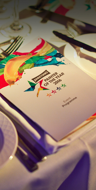
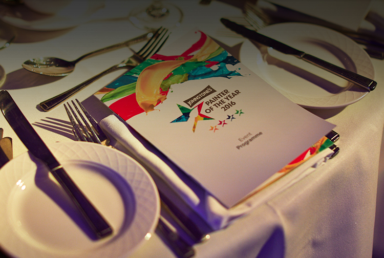
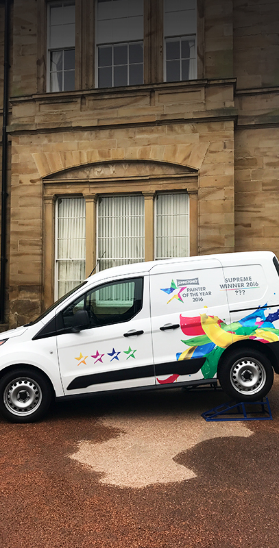
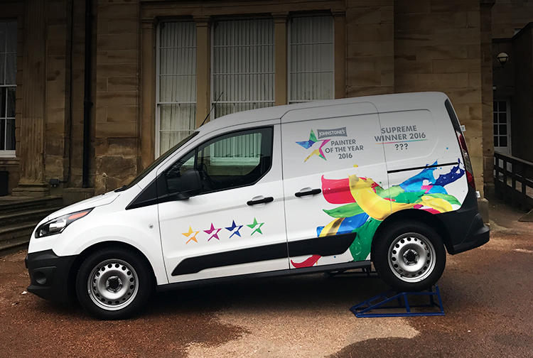
Previously, Johnstone's POTY branding was very minimalistic and straight to the point. The client wanted a total refresh, incorporating realistic paint splashes into the logo which were then utilized throughout the whole of the event.
Coming from a history of paint, of course, you can imagine that this client craved some colour; their main requirement for the rebrand was that they wanted something bright and eye-catching.
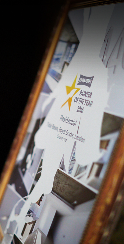
For the final logo design, we used bright, realistic paint splashes in the four main colours that symbolised each category up for nomination - Residential (yellow), Commercial & Leisure (green), Restoration (blue) and Health & Education (pink).
We used the splashes to make up the iconic Johnstone's POTY star and used grey, bold text to make the colours POP in the star, as well as the category stars beneath.