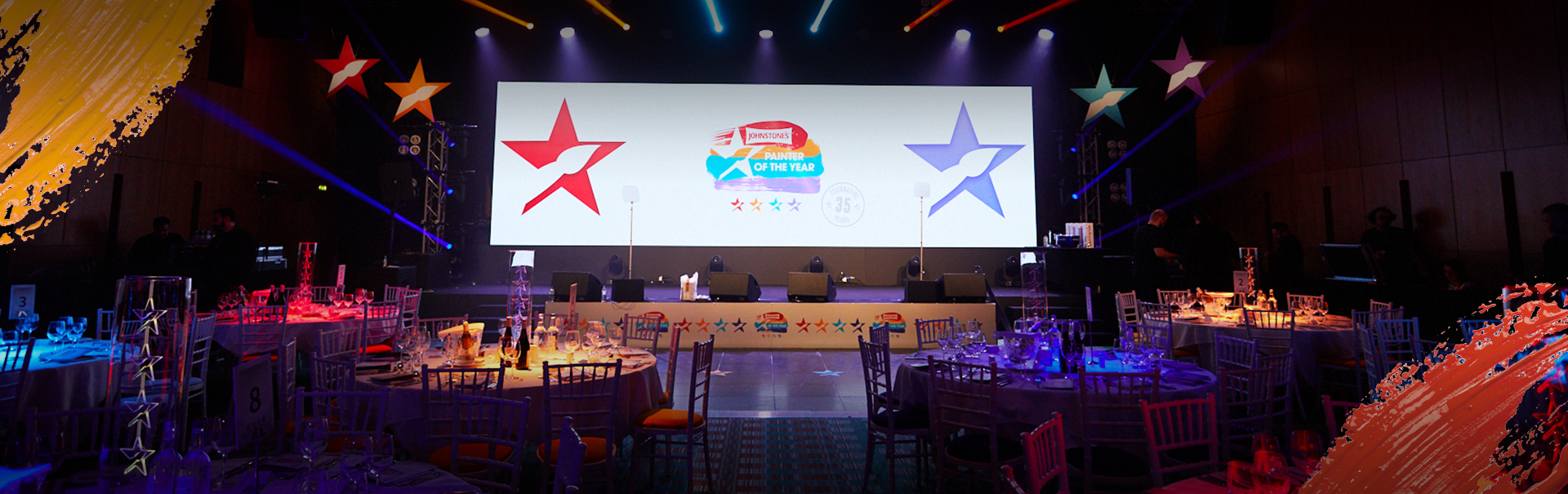
Bold, Bright, Colourful & Classy
Having set the bar in the previous year, Wellpleased aimed to do the exact same this year. They approached us with a vision in mind and we definitely achieved that!
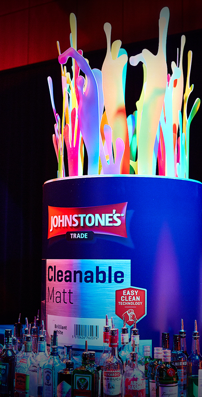
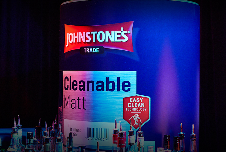
With it being the 35th anniversary of Johnstone's Painter of the Year, the client wanted to execute the event with a classy touch but keeping in mind the colourful nature of the business and brand. Keeping the idea of realistic paint brush strokes, the client wanted this to be carried throughout the logo and the brand as a whole - with a 'primary colour red', 'warm orange', 'baby blue' and an 'electric purple' colour palette.
The logo consists of 4 realistic brush strokes with the logo cut out in the middle. The touch of class comes in with light grey to white gradients utilised throughout the event.
This theme was executed magnificently and utilized across a number of other aspects which Allstar designed, the list includes van livery, wall and floor vinyls, the stage skirt, step and repeat board, the table plan, table numbers, paint tin style decorations and much, much more!