Ross was delighted with the outcome and gave us the thumbs up
It's common for clients to approach you about a design, and for them to not really know themselves what it is that they're looking for. That's where we come in, strapping on our thinking caps and doing the hard work for you; Allstar will help you from start to finish, to develop your brand, continually sharing our ideas and forming a relationship that lasts a lifetime! Ross told us that he wanted his brand to stand out, being bold and powerful, but aside from that, he didn't really know what he wanted.
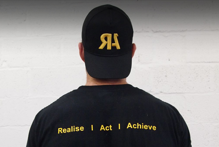
He had already established the name "RA Nutrition" and this was what we had to work with. For Ross' logo, we wanted something that was clear and distinctive, something that would be instantly recognisable for Ross and his growing brand. The end product was a clean text stamp of "RA", with the application of the Gestalt theory applied to the 'A' - meaning it wasn't the whole letter, but people would still recognise what the image was, just by glancing at it. The colour choice made by Allstar was a warm, gold mustard that accompanies a dark grey background; this effectively emphasises the logo stamp.
Ross was delighted with the outcome and gave us the thumbs up; a happy client is a job complete, and the team love to revel in the glory.