Initially, the client had requested a brochure that detailed each category finalist, along with imagery to showcase their work. The brief then changed to the brochure containing a run through of the event, the menu, a list of guest speakers, the chosen charity for the event proceeds to go to, and a welcome section.
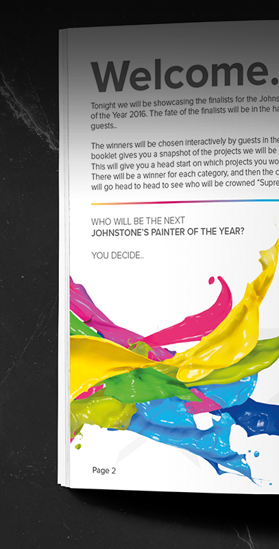
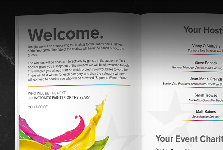
We wanted the brochure to stand out and link in with the paint and decorating style. We wanted to create a page-turner, an attention-grabber, a crowd pleaser... and we did just that!
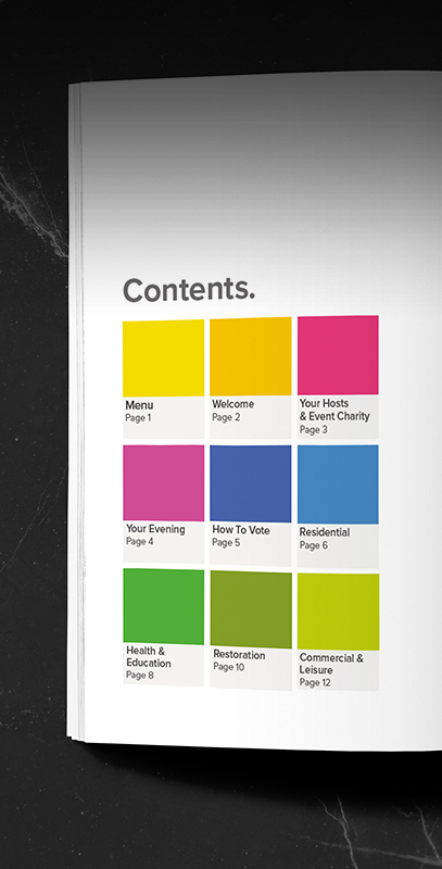
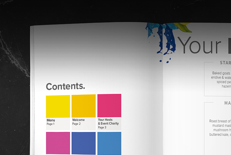
Our design team created a contents page that mirrored a swatch or Pantone style, rather than having a wordy first impression - we wanted the WOW factor from the first interaction. The text content throughout the programme had a soft, grey colour that allowed the bright paint splashes and colour palette to truly compliment it.
The main aim of the programme was to make it visually appealing, and for readers to feel pleasantly glued to the pages, like a good book you just can't put down. This is where we used icons and illustrations to explain the order of events for the evening, as well as icons explaining what the entry criteria process was based on.
The order of service was based on a timeline style - plain, clean, simple - with the category award segments standing out in their assigned colour. Allstar wanted the category nominees section to fully showcase their work and projects, which is why we used a full page to display their strongest image, amid the other nominees for that category.