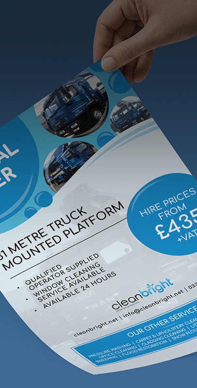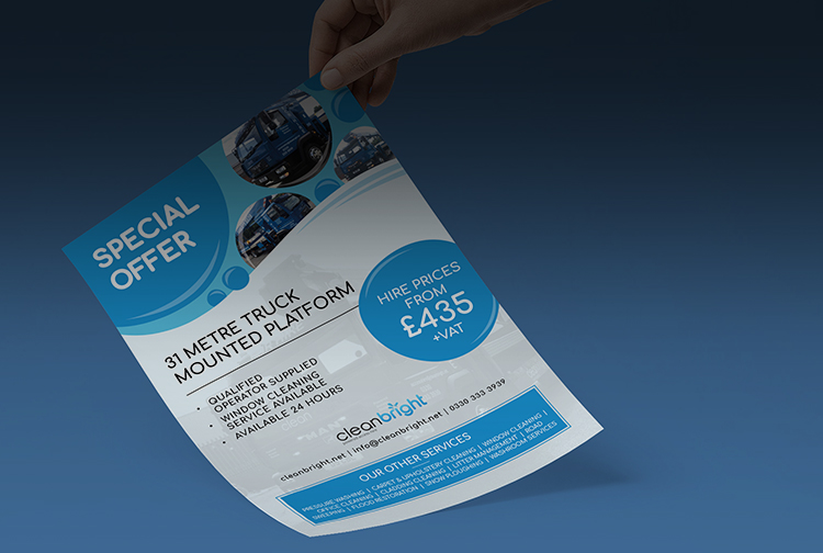
Fun and friendly feel!
The old style branding displayed 'CleanBright' in a bubble writing, brushed in a grey and black coat. This mix of colour left the branding feeling tired, aged, and in serious need of some R&R. Our design team set the ball rolling by creating a new logo; they decided that the branding was strongest with the business name anchored to the logo, as this ensured that the familiarity wasn't lost in a completely new design. Focusing on the word 'bright', our team opted for an azure blue to represent the 'end result' from using CleanBright's services, clean, fresh, professional. They then added water droplets which splash from the top of the 'i' in 'bright', to create a fun and friendly feel; we have since incorporated these droplets into business cards, leaflets and social media for the business.